The "VitalValve Technologies" logo design draws inspiration from the human heart, becoming a bridge between advanced technology and the crucial role that heart valves play in our health. 🌟
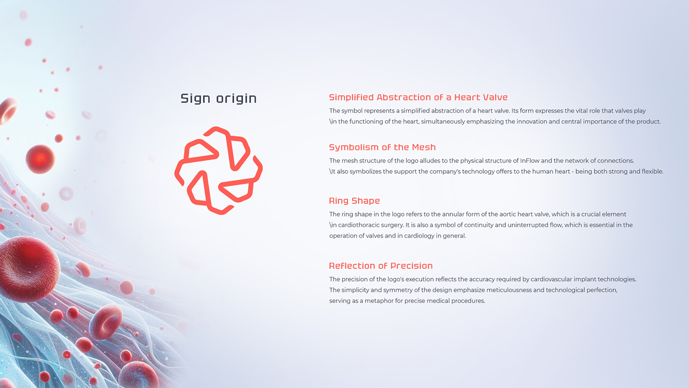
Simplified Abstraction of a Heart Valve
The symbol is a simplified abstraction of a heart valve, emphasizing its essential function and central importance in every person's life. The heart, as the source of life, has been reduced to its pure form, aiming to illustrate the product's innovation.
The symbol is a simplified abstraction of a heart valve, emphasizing its essential function and central importance in every person's life. The heart, as the source of life, has been reduced to its pure form, aiming to illustrate the product's innovation.
Mesh Symbolism
The logo features a mesh construction, which refers to the structure and connections within the human heart, simultaneously symbolizing the support, strength, and flexibility that the "VitalValve" technology offers. This part of the project aims to depict how technology becomes a support for the natural function of the heart, making it stronger and more resilient.
The logo features a mesh construction, which refers to the structure and connections within the human heart, simultaneously symbolizing the support, strength, and flexibility that the "VitalValve" technology offers. This part of the project aims to depict how technology becomes a support for the natural function of the heart, making it stronger and more resilient.
Ring Shape
The ring shape of the logo refers to the annular form of the aortic heart valve, emphasizing the importance of continuity and uninterrupted flow, both physically and symbolically. This design element symbolizes eternity, renewability, and seamless operation, key for cardiology.
The ring shape of the logo refers to the annular form of the aortic heart valve, emphasizing the importance of continuity and uninterrupted flow, both physically and symbolically. This design element symbolizes eternity, renewability, and seamless operation, key for cardiology.
Reflection of Precision
The "VitalValve Technologies" logo is crafted with remarkable precision, reflecting the accuracy required in medical technologies, especially those related to the heart and its valves. The simplicity and symmetry of the design are metaphors for meticulousness and technological perfection, highlighting the advancement and reliability of the solutions offered.
The "VitalValve Technologies" logo is crafted with remarkable precision, reflecting the accuracy required in medical technologies, especially those related to the heart and its valves. The simplicity and symmetry of the design are metaphors for meticulousness and technological perfection, highlighting the advancement and reliability of the solutions offered.
In creating this logo, we wanted to convey the vision of "VitalValve Technologies" as a leader in innovative solutions for cardiology, combining aesthetics, functionality, and above all, care for the human heart.